- News
- Reviews
- Bikes
- Components
- Bar tape & grips
- Bottom brackets
- Brake & gear cables
- Brake & STI levers
- Brake pads & spares
- Brakes
- Cassettes & freewheels
- Chains
- Chainsets & chainrings
- Derailleurs - front
- Derailleurs - rear
- Forks
- Gear levers & shifters
- Groupsets
- Handlebars & extensions
- Headsets
- Hubs
- Inner tubes
- Pedals
- Quick releases & skewers
- Saddles
- Seatposts
- Stems
- Wheels
- Tyres
- Tubeless valves
- Accessories
- Accessories - misc
- Computer mounts
- Bags
- Bar ends
- Bike bags & cases
- Bottle cages
- Bottles
- Cameras
- Car racks
- Child seats
- Computers
- Glasses
- GPS units
- Helmets
- Lights - front
- Lights - rear
- Lights - sets
- Locks
- Mirrors
- Mudguards
- Racks
- Pumps & CO2 inflators
- Puncture kits
- Reflectives
- Smart watches
- Stands and racks
- Trailers
- Clothing
- Health, fitness and nutrition
- Tools and workshop
- Miscellaneous
- Buyers Guides
- Features
- Forum
- Recommends
- Podcast
feature
 Orica Scott laughing (1).jpg
2017 UCI WorldTour kits: The good, the bad, and the… what were they thinking of?!?
The 2017 race season starts in less than a month and if you want to know what's going on in the peloton you need to know who's who.
Here's our guide to the kits that the big teams will be wearing.
AG2R La Mondiale
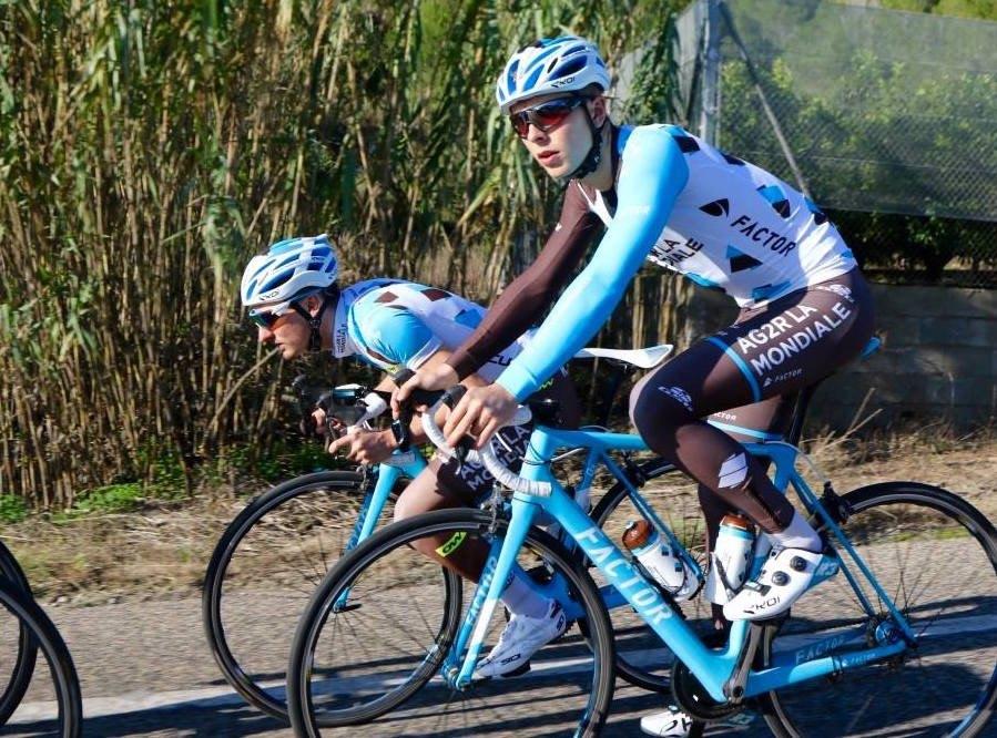
Brown shorts? Who’d opt for brown shorts? AG2R La Mondiale riders have been working the look for years and 2016’s asymmetric sleevage remains for 2017 too. It’s a ker-azy concept but we have to admit that it works alongside the sky blue bikes… speaking of which, the team is switching from Focus to Factor for 2017, and they look stylish too.
Très bien!
Astana Pro Team
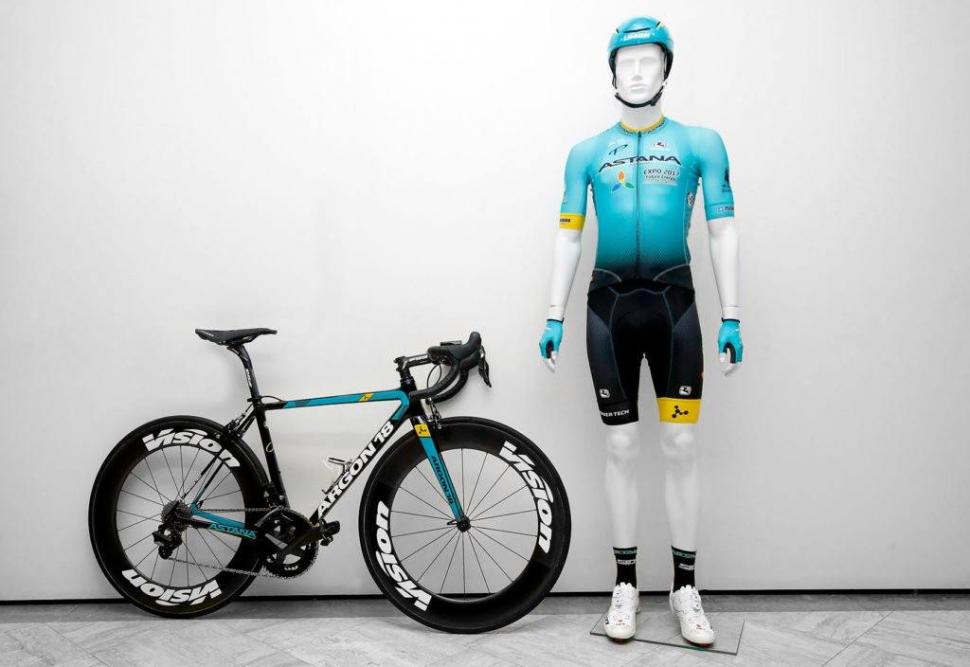
As well as swapping from Specialized to Argon 18 bikes for 2017, Kazakhstan’s Astana has switched from Moa to Giordana as technical clothing supplier. The jersey remains predominantly light blue but there’s less yellow on the collar and a yellow band has been added to the right sleeve. The shorts are now grey/black with a yellow band on the left leg.
Never thought we’d say it, but we preferred the blue shorts. They’re altogether more Euro pro. Yeah, controversial. We don’t sidestep the big issues here at road.cc.
Bahrain-Merida
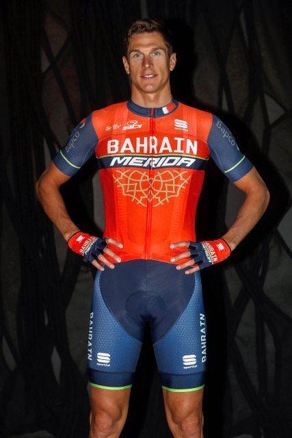
Fair play. The Bahrain team’s colours are red, blue and gold, and Merida’s corporate colour is bright green. Working with that lot could give a designer some sort of breakdown and result in a right old shambles (see Lampre Merida’s pink, blue and green fusion from the past couple of years) but this Sportful kit manages to look classy.
When you open that zip on a hot climb it’s going to say ‘bah’ on one side and ‘rain’ on the other, which is the sort of thing you might see written on a novelty umbrella.
Just an observation. We’ll move on….
BMC Racing Team
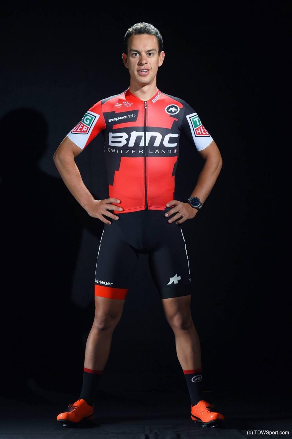
Oops! We’ve disturbed Richie Porte halfway though a performance of the Macarena, a skill for which he is admired and feared in equal measure. We’ll only be a sec.
BMC will be rocking Assos kit for 2017, having made the switch from Pearl Izumi. The biggest change to the appearance is the addition of white panels on the sleeves and whopping great Tag Heuer logos. They look like a bit of an afterthought, but you can hardly miss them, and we guess that’s the point. In the remote chance that you did fail to spot the marketing, the team members are all wearing smart new watches in the publicity shots, so good for them.
Back to it Richie.
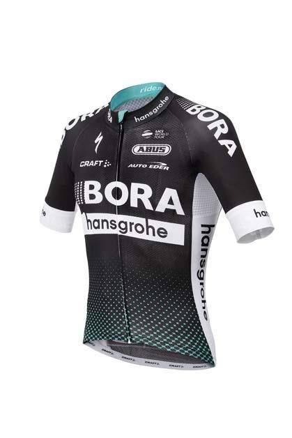
Bora-Hansgrohe
Bora-Argon 18 is now Bora-Hansgrohe, the Argon 18 bike brand having headed off to Astana. The Craft kit is black, white and green whereas there was a lot of red in there before. We have to say that it doesn’t really do it for us – it’s just a bit dull – but, clutching at straws, we guess fans of dots will be happy as Larry.
Cannondale-Drapac
Looking forward to seeing these together in action next season @Ride_Argyle #POC #POCTeam #RouleurClassic #greenargyle pic.twitter.com/sGRQ2EwJKg
— POC (@POCSports) November 4, 2016
“Red and green should never be seen without a colour in between.”
We admire Cannondale’s flagrant disregard for traditional fashion advice. Rules are for fools.
Castelli no longer supplies Cannondale-Drapac, having made the jump to Team Sky, so performance clothing supplier duties now fall to Poc. The team is sticking with the green argyle for 2017 and rightly so. It’s a strong look! Fierce.
Dimension Data
Introducing Team Dimension Data for Qhubeka v.2017...
Here's a closer look at @TeamDiData's brand new kit!#DDDCamp #AfricasTeam pic.twitter.com/Uin4wuo1Ku— Dimension Data Sport (@DiDataSport) November 24, 2016
Mark Cavendish’s Team Dimension Data for Qhubeka has more green on its jersey than before, subtle hands in the stripe on the back symbolising the children who receive help through the team (the aim is to help mobilise people in parts of Africa).
Solid and stylish. this kit might not be vying for a top spot in the league, but it's definitely capable of a good cup run.
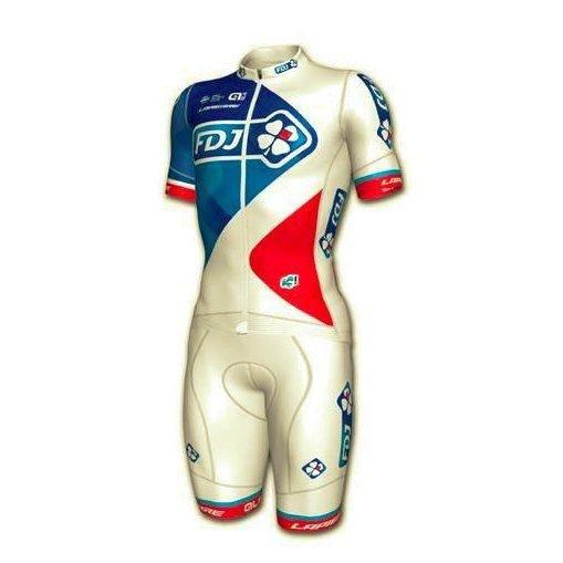
FDJ
Alé has taken over from B’Twin as clothing supplier to French team FDJ although the design remains very similar to before. White shorts? Okay, if you’re sure. Just be careful when it rains. No one needs to see that.
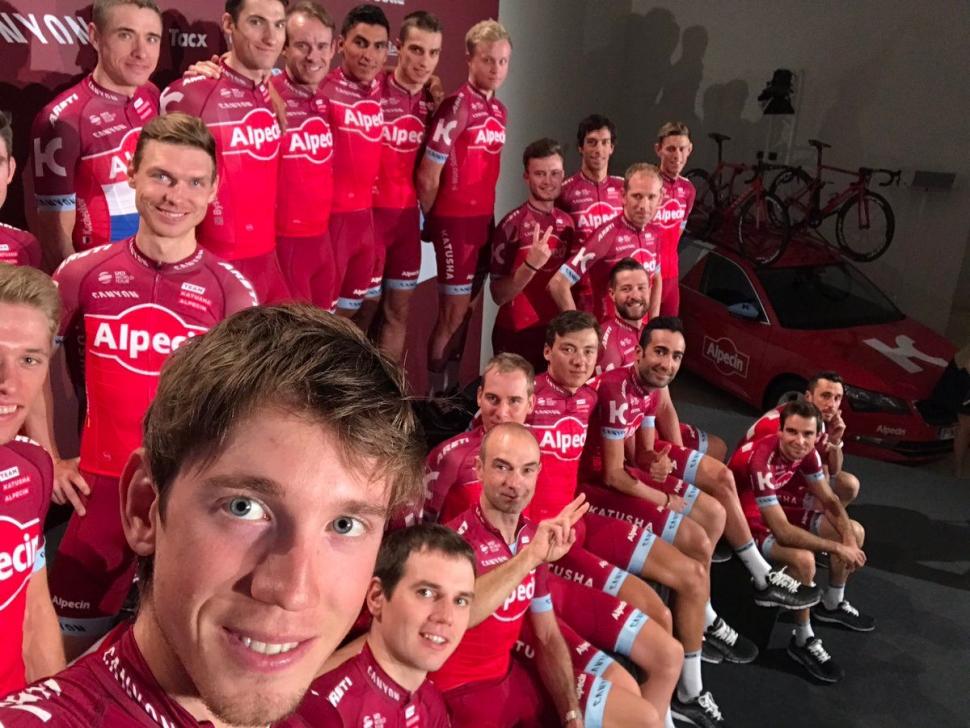
Katusha-Alpecin
Russia’s Katusha has had a couple of, let’s be honest, absolutely shocking kits in its relatively short history. This one, though, is bold and distinctive. Some critics have gone so far as to say that the team kit has gone from ‘horrendous’ to ‘not too bad, actually’ over the past couple of years.
Oy, you at back: that means something different over here. Stop it.
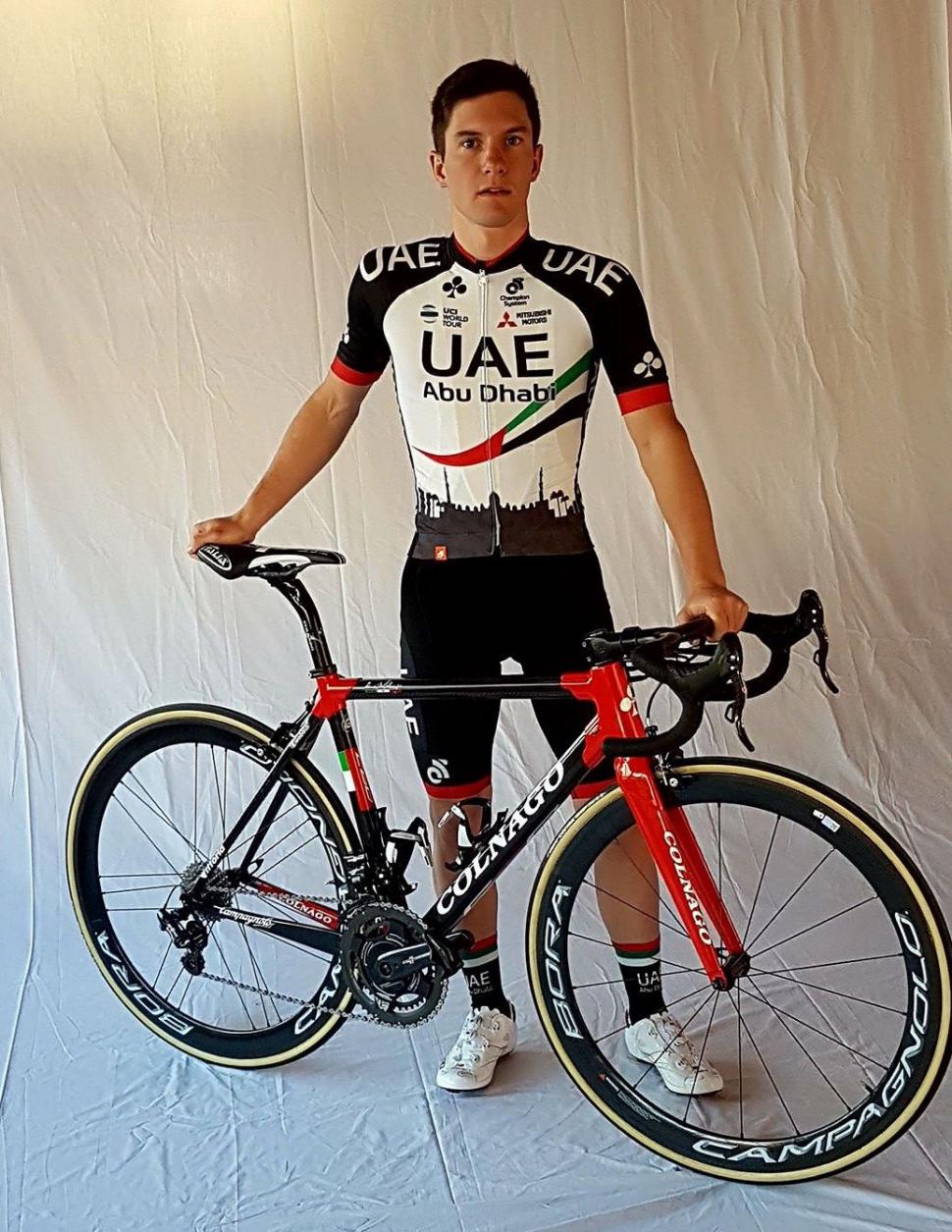
UAE Abu Dhabi
Lampre-Merida’s WorldTeam licence has now been transferred to UAE Abu Dhabi.
Katusha used to have a silhouette of the Kremlin on its jerseys, but binned it off last year. UAE Abu Dhabi has stepped into the silhouette void with a representation of the Sheikh Zayed Grand Mosque. Obviously. We’re not sure the full splendour of the architecture translates that well onto a synthetic cycling jersey but, hey, the bike looks pretty cool.
LottoNL-Jumbo
Really proud to show you guys my new team colors for the next two years. @LottoJumbo_road pic.twitter.com/i1HOkGrwJg
— Lars Boom (@lars_boom) January 1, 2017
The Dutch LottoNL-Jumbo team has switched from Santini to Shimano clothing for 2017 – it's branded as S-phyre. The numbers on the lottery balls across the chest remain the same as before: 24, 2, 6, 37, 15, 45. If all those numbers come up one week there will have to be some sort of enquiry.
Lotto-Soudal
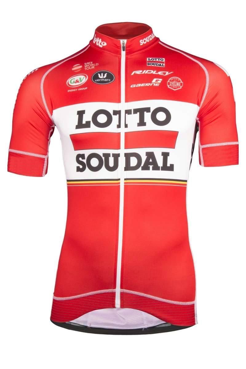
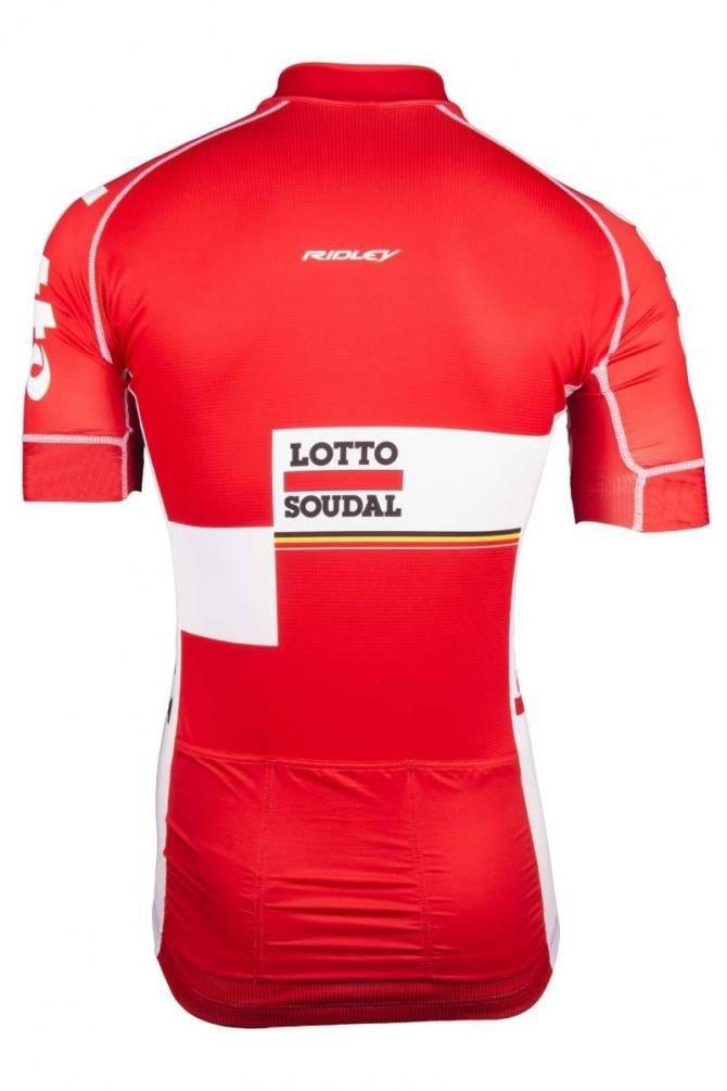
Lotto-Soudal’s jersey is the same but different for 2017. A few of the logos have altered but not much else. Have a guess at why the team logo is now repeated high on the chest. Give up? Selfies. No, really. What is the world coming to? First man buns, now this.
That design at the rear, which looks like a printing error, is really going to wind up the OCD sufferers among us.
Movistar Team
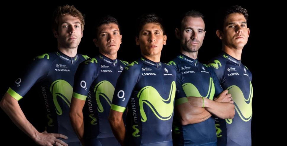
Movistar has tweaked the design of its Endura-made jersey so it’s a little less fussy than before, but it’s still instantly recognisable with the huge green M across the front. We swear that M gets bigger every year and it’s now spilling off the sides. If it gets any bigger it’ll turn into a V, and then where will we be?
The kit looks pretty cool to us, you’d think they’d be a bit happier about it. Crack a smile lads.
Orica-Scott
“…so the doctor says, “There's my thermometer! Now where the hell did my pen go?”
Arguably, this is taking the smiling thing too far.
First they were GreenEdge, then Orica-GreenEdge, then Orica-BikeExchange, and now they’re Orica-Scott. Frequent name changes ensure lots of fresh new kit on a regular basis. We know their game.
Quick-Step Floors Cycling Team
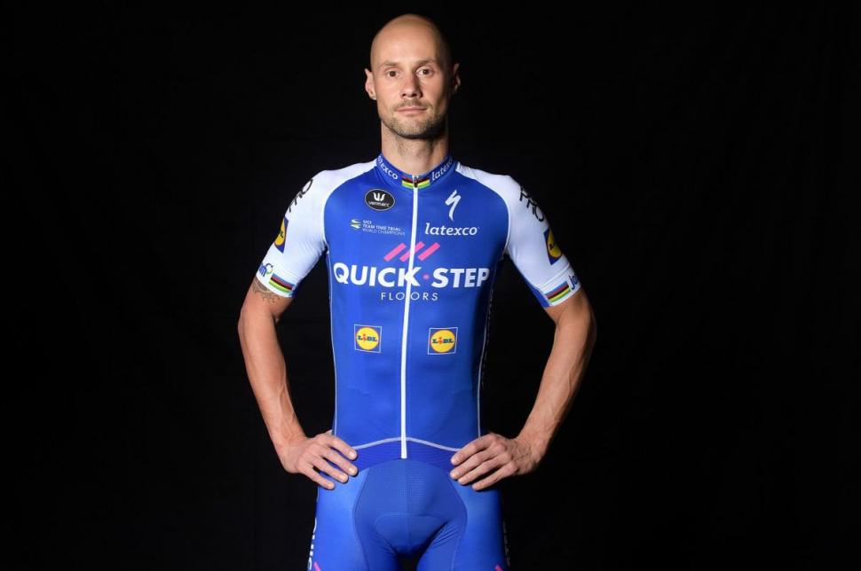
Hang on! Didn’t we have this jersey a few years ago? [Checks archives] It’s quite similar to the Quick-Step jersey of 2011, and Tom Boonen is still in the squad. Surely he could have just gone up in the loft and got his old one out again.
Does that make the kit dated, classic, or retro? It’s so hard to tell these days. It’s blue and white, we can tell you that with a reasonable degree of certainty.
Team Sky
Sky announced to the world last month that it was swapping from Rapha to Castelli, and the world, having known for months, pretended to be surprised. The placement of the scorpion logo up on the shoulder looks a bit squeezed in but it’s in a good position for those head-on action shots. Always thinking, those marketing bods.
Each stripe on the jersey, shorts, mitts, socks and cap represents a specific Team Sky victory. The longest lines are the four Tour de France wins. The short dashes on the jersey represent one-day races, while the medium-length lines represent multi-day stage races, with the number of stages determining the length of the line. WorldTour races are blue lines, while non-WorldTour races are white.
It’s obvious when someone points it out, isn’t it?
Sunweb-Giant
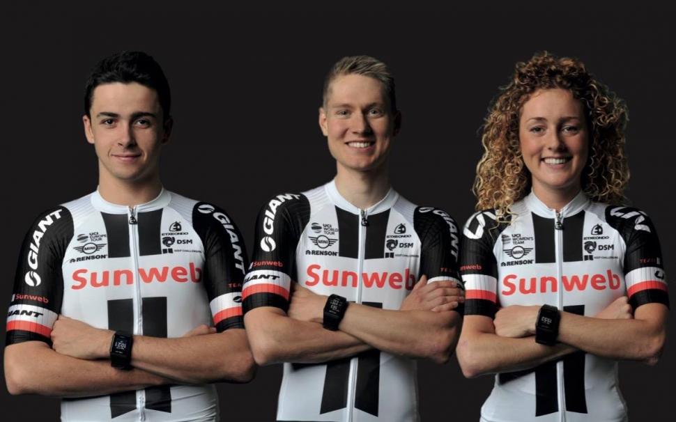
The Alpecin half of Giant-Alpecin has jumped ship and headed for Katusha, so no more free caffeine shampoo for this crew. Baldness could be on the horizon. Sunweb is a holiday company and we have just a sneaking suspicion that Polar heart rate monitors might be involved in some sort of team deal.
Toon Army!
Trek-Segafredo
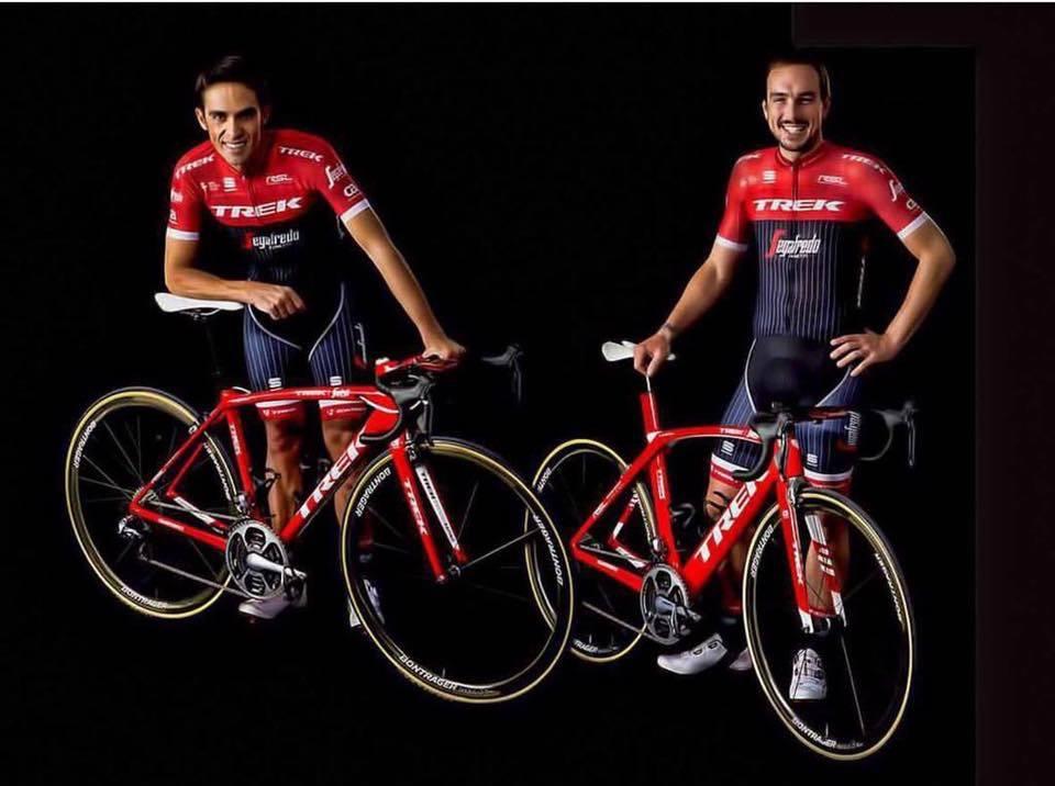
Trek has been big on pinstripes for ages now, doggedly ignoring market trends and ploughing its own furrow. Perseverance: we like that. For 2017 the designers have switched from red logos on a white background, to white logos on a red background. When will this madness ever end?
Nippo–Vini Fantini
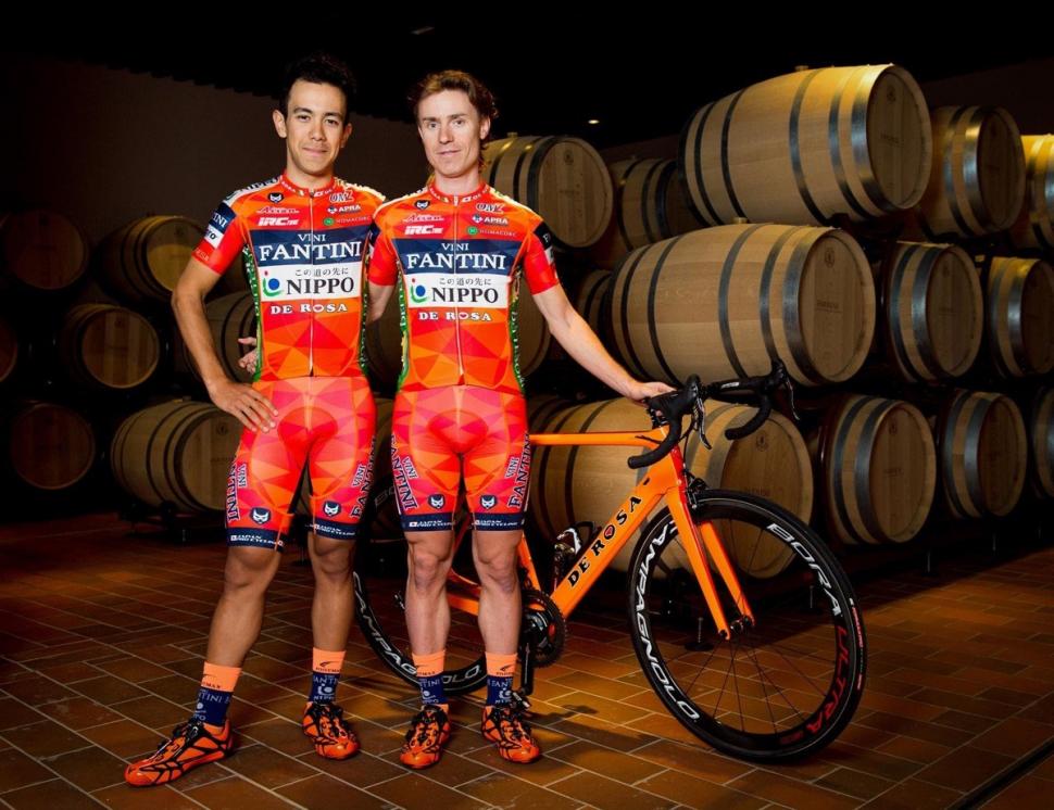
Is there such a thing as too much orange? Yes. Can you have too many triangles on your team kit? No. We’re right behind triangles here at road.cc. That means we’re conflicted over this kit from Pro Continental team Nippo-Vini Fantini.
As far as logo placement goes, “busy” would be the polite way to describe it.
Right, over to you. What do you reckon? Give us your top 3 in the comments below.
Mat has been in cycling media since 1996, on titles including BikeRadar, Total Bike, Total Mountain Bike, What Mountain Bike and Mountain Biking UK, and he has been editor of 220 Triathlon and Cycling Plus. Mat has been road.cc technical editor for over a decade, testing bikes, fettling the latest kit, and trying out the most up-to-the-minute clothing. He has won his category in Ironman UK 70.3 and finished on the podium in both marathons he has run. Mat is a Cambridge graduate who did a post-grad in magazine journalism, and he is a winner of the Cycling Media Award for Specialist Online Writer. Now over 50, he's riding road and gravel bikes most days for fun and fitness rather than training for competitions.
Latest Comments
- Hirsute 7 min 42 sec ago
Where I am they had a number of issues of people queuing in the roads for the tip and disrupting traffic. The police had to intervene a couple of...
- Rendel Harris 12 min 11 sec ago
That's only for longer journeys; obviously for short trips he employs the sedan chair.
- Rendel Harris 13 min 16 sec ago
No particular sympathy for MVDP, he knew the rules and chose to break them and so gets the punishment. However, isn't it time that we did away with...
- Tony W. 52 min 29 sec ago
In accordance with the highway code ? bus driver was breaking the speed limit, overtaking a child on a bicycle, he should've as far right as...
- polainm 1 hour 9 min ago
One is permantly in misery mode, the other all blacked out in stealth mode.
- mark1a 1 hour 26 min ago
...and go and ride your bike for two hours or less.
- polainm 1 hour 43 min ago
Just put in planning permission for a NASA sized warehouse the area of ten football pitches, right up against local housing. That'll go through no...
- Rome73 2 hours 38 min ago
It reminds me of the joke that used to do the rounds when I was younger;...
- David9694 4 hours 45 min ago
Down my way, a 200 yard bus gate or 20 mph limit extinguishes all economic and domestic life, so I assume Paris centre-ville has been rendered a...

Add new comment
20 comments
"The longest lines are the four Tour de France wins."
Funny that...
Far too much black and navy. At least Cannondale, Lotto NL and AG2R are easily recognisable esp on the inevitable bad quality images of races.
Bah!!! Rain!!!
ROFLLLLLLLLLLLL
AG2R La Mondiale. I could never wear it. I've seen a Sunday rider in it that just re-enforces my opinion that no one but the pros should wear it. But it is so classy on TV and with the demise of Rabobank in the Grand Tours is it the oldest kit in the peleton now?
Happy for Bertie. He must be so pleased to get away from both Tinkoff and the hi vis yellow. The new Trek kit looks great.
FDJ should have stuck with the basae blue thye had two years ago.
I don't mind Sky's.
All the rest are leave with listless and without an opinion either way.
Condor JLT have a nice looking kit this year too though!
Lotto-Soudal [+]
Just wish either Lotto or Soudal would end their sponsorship so it can become a retro kit and therefore eligible for mere mortals to wear.
Makes me realise how awful looking most team jerseys are, the only one that has any actual design on it is sky everything else just looks like the back pages of a free newspaper.
Hadn't realised Benedict Cumberbatch had signed for Bahrain-Merida...
...true that I'm going to miss the free bottles of Alpecin. :-(
Cannondale FTW! Can they at least win this as they chalked up a goose egg last year on the road? Also, I feel uneasy saying Bahrain's kit looks good because I don't want to condone them. If you say their kit is ugly, will it mean immediate imprisonment?
What are the functions of team kit?
To promote the sponsor
To be visible - to teammmates in the peloton, on the road and on the telly
To shift replica kit to fans
But first, foremost and always, to cover your ar54 crack
Now I'm neither fashion guru nor marketing expert, but isn't it time FdJ were obliged to respect the rules of decency?
Dimension Data is definitely an improvement over last year's design, looks like it was actually designed and not just printed at the start of the season in a rush because nobody had got round to it.
Not sure about the kit for trek, but the bold bike colour definitely stands out to me.
Sky's takes too much explaining, it's certainly not the worst but it's a bit dull.
Bora looks like they 'borrowed' the designs from the leopard trek team from a few years ago.
I also hadn't realised Tony Martin had gone to Katusha, that's a whole lot of pinky red going on in that kit, wouldn't like to be the one that has to wash that with anything else...
Think my favourites are Movistar, Cannondale and Dimension Data
quickstep and lotto both need the hidden zip
I see that Quick-Step have finally, after fifteen years, realised that almost nobody knows they sell floors.
Nobody outside of Belgium that it is.
Sky looks classy, Lotto Soudal classic but favourite is Movistar, strong clean design imho.
Dogs of the bunch would be AG2R again but Katusha pretty ropey too.
Are there no womens teams in 2017?
It's disappointing that BC aren't the only ones disregarding or devaluing women's cycling.
Canyon's last year was the best looking regardless of gender.
Seconded. Best kit of last season bar none.
The Article is titled UCI World Tour Team kits.
Maybe in a month or so, when the Womens Tour is about to warm up we will get one to show off their kits.
You can't please some people, unless of course you have an alterior reason to look at women in tight fitting Lycra?