- News
- Reviews
- Bikes
- Accessories
- Accessories - misc
- Computer mounts
- Bags
- Bar ends
- Bike bags & cases
- Bottle cages
- Bottles
- Cameras
- Car racks
- Child seats
- Computers
- Glasses
- GPS units
- Helmets
- Lights - front
- Lights - rear
- Lights - sets
- Locks
- Mirrors
- Mudguards
- Racks
- Pumps & CO2 inflators
- Puncture kits
- Reflectives
- Smart watches
- Stands and racks
- Trailers
- Clothing
- Components
- Bar tape & grips
- Bottom brackets
- Brake & gear cables
- Brake & STI levers
- Brake pads & spares
- Brakes
- Cassettes & freewheels
- Chains
- Chainsets & chainrings
- Derailleurs - front
- Derailleurs - rear
- Forks
- Gear levers & shifters
- Groupsets
- Handlebars & extensions
- Headsets
- Hubs
- Inner tubes
- Pedals
- Quick releases & skewers
- Saddles
- Seatposts
- Stems
- Wheels
- Tyres
- Health, fitness and nutrition
- Tools and workshop
- Miscellaneous
- Cross country mountain bikes
- Tubeless valves
- Buyers Guides
- Features
- Forum
- Recommends
- Podcast
 Xirayas de San Luis kit (source Facebook).jpg
Team kit as cartoon anatomy lesson? Another attention grabbing women's team kit from Latin America
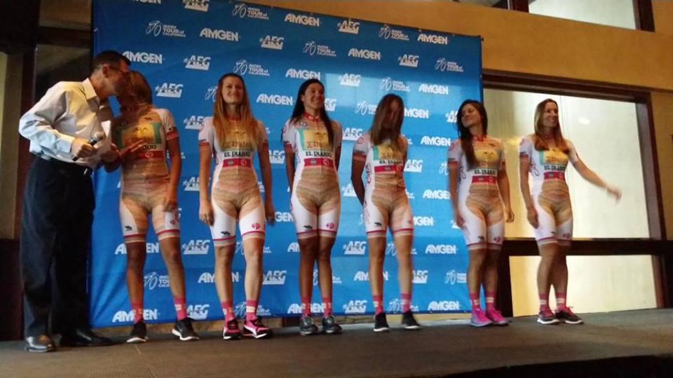
What is it with Latin American women’s teams? Back in 2014, one from a Colombian made the news with a kit that seemed to have a nude panel on it, while this year a team from Argentina has not only one of the brightest kits we’ve seen, but one that at first glance seems to be based on a cutaway anatomical model.
The kit belongs to UCI Continental team Xirayas de San Luis, shown in the picture above at the presentation of the Tour Femenino de San Luis 2016. As a description of the kit goes, it’s difficult to top this one from VeloNews journalist Dan Wuori.
If Jerry Garcia taught anatomy... pic.twitter.com/5uMcK5Om3j
— Dan Wuori (@dwuori) February 13, 2016
The kit does seem to be a hit with fans, though – currently, it is in second place on a poll on the blog Prowomenscycling.com for the best kit outside the UCI Women’s WorldTour.
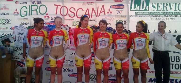
In September 2014, the Colombian IDRD-Bogota Humana-San Mateo-Solgar women's team found itself at the centre of a storm as a result of this photo taken at the Giro della Toscana.
The picture went viral and even UCI president Brian Cookson chipped in, saying on Twitter “It is unacceptable by any standard of decency.”
It turned out however that the seemingly flesh coloured panel was in fact gold – the photograph had simply been taken in poor light.
The kit itself was designed by one of the team’s riders, Angie Tatiana Rojas, who explained that the colours chosen were simply "to highlight our team's sponsors, that was always the goal" and that neither she nor her team mates were embarrassed to wear it.
She added: "As an athlete, as a woman, as the cyclist that I am, I wouldn't be ashamed with this kind of design."
> Video: Colombian riders "not ashamed" of That Kit
Similarly the 2015 Xirayas de San Luis kit, shown below, could also appear flesh coloured, depending on the light ... not an accusation that can be levelled at this season’s outfit.
On closer inspection though, that’s an optical illusion on last year’s kit, which has a Missoni-inspired zig-zag motif.
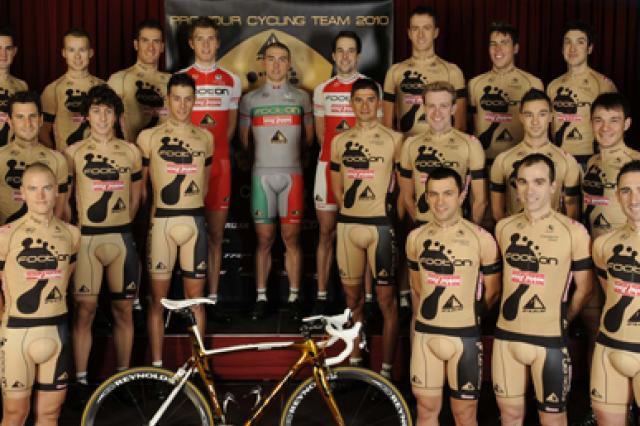
Of course, it’s not just in women’s cycling that kits can attract attention and even ridicule – remember Footon-Servetto’s gold kit with the giant black foot on it?
Which kits – men’s or women’s – do you remember as being particularly striking for their design, good or bad?
Simon joined road.cc as news editor in 2009 and is now the site’s community editor, acting as a link between the team producing the content and our readers. A law and languages graduate, published translator and former retail analyst, he has reported on issues as diverse as cycling-related court cases, anti-doping investigations, the latest developments in the bike industry and the sport’s biggest races. Now back in London full-time after 15 years living in Oxford and Cambridge, he loves cycling along the Thames but misses having his former riding buddy, Elodie the miniature schnauzer, in the basket in front of him.
Latest Comments
- JEMVisser 2 min 49 sec ago
Yes, higher is better. You ever seen a time trialist some 10-15 years ago? Low aero bars and stretched out. Now they are all riding in that high...
- stonojnr 25 min 1 sec ago
Alex Richardsons attack mentioned in the article happened at 3pm in the afternoon. Jen George was already 2-3hrs into her ride, and escaped to an...
- Hirsute 49 min 51 sec ago
"If we can't park, we can't play and if we can't park, we can't grow."...
- KiwiMike 1 hour 26 min ago
Sorry, I left my metallurgy degree at the pub....
- eburtthebike 2 hours 5 min ago
Stick with it and remember that empty vessels make the most noise. Many of those people on social media won't even live there, they've just been...
- fukawitribe 2 hours 24 min ago
Fuck off
- Rendel Harris 3 hours 32 min ago
That was my reaction too on another thread but actually, as mdavidford pointed out, it's probably intended to mean "the experience of being...
- Hirsute 4 hours 53 min ago
Given he got the minimum for culpability/harm I don't see it that way.
- agp 5 hours 32 min ago
great to see this elitist BS soldiering along...
- OnYerBike 6 hours 36 min ago
Not suggesting that the hub design might not be flawed in general, but it seems pretty fanciful to imagine it would have affected the outcome of...


Add new comment
4 comments
I think I can see a penis.
It's less boring than most any of the other team's kits, I like it.
Men don't have much room to criticize, IMO. Regardless of the color of mens' kits they're inevitably giving an anatomy lesson of their own.
That is a good looking kit.
And they look fast even standing still.
Why are we always judging garments?
Let them use whatever they want.
I like the colors and the moto behind it.