- News
- Reviews
- Bikes
- Accessories
- Accessories - misc
- Computer mounts
- Bags
- Bar ends
- Bike bags & cases
- Bottle cages
- Bottles
- Cameras
- Car racks
- Child seats
- Computers
- Glasses
- GPS units
- Helmets
- Lights - front
- Lights - rear
- Lights - sets
- Locks
- Mirrors
- Mudguards
- Racks
- Pumps & CO2 inflators
- Puncture kits
- Reflectives
- Smart watches
- Stands and racks
- Trailers
- Clothing
- Components
- Bar tape & grips
- Bottom brackets
- Brake & gear cables
- Brake & STI levers
- Brake pads & spares
- Brakes
- Cassettes & freewheels
- Chains
- Chainsets & chainrings
- Derailleurs - front
- Derailleurs - rear
- Forks
- Gear levers & shifters
- Groupsets
- Handlebars & extensions
- Headsets
- Hubs
- Inner tubes
- Pedals
- Quick releases & skewers
- Saddles
- Seatposts
- Stems
- Wheels
- Tyres
- Health, fitness and nutrition
- Tools and workshop
- Miscellaneous
- Cross country mountain bikes
- Tubeless valves
- Buyers Guides
- Features
- Forum
- Recommends
- Podcast
news
 Shutt VR competition
Sabbath and Shutt VR want YOU to get creative on their new jersey… there's prizes too!
Ever seen some cycling kit and thought, "I could do better than that"? Well, now's your chance to have a go, courtesy of Sabbath Bicycles and Shutt VR. They're getting together to produce some suitably flash kit to match Sabbath's luscious titanium bikes and they'd like road.cc users to design it.
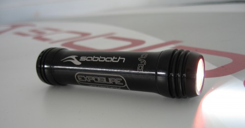
To get your creative juices flowing we'll be running a competition to find the right design – the winner will get a set of their kit and a Sabbath branded USE Joystick light plus of course the mighty satisfaction of seeing their creativity made flesh, well Merino Perform.

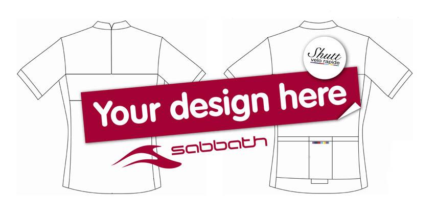
Entries are open now and the best five will go to a public poll in three weeks time so get your skates on! The jersey needs to have the Sabbath logo as the main one, with the Shutt VR logo on the chest. You can submit your entries in any form you like, what matters most is the power of your design. We've attached a blank template to the bottom of this story; those that want to go down the electronic route can import it in to programs like Photoshop or Illustrator, or you can keep it real and print them out and draw on them – either works for us. Or you can just go for the completely freehand approach.
Ideally we'd like you to attach a pic of your design to the bottom of this story, in true road.cc fashion, but you can also email them to info@road.cc or post them to road.cc, The Bath Brewery, Toll Bridge Rd, Bath, BA1 7DE.
road.cc's founder and first editor, nowadays to be found riding a spreadsheet. Tony's journey in cycling media started in 1997 as production editor and then deputy editor of Total Bike, acting editor of Total Mountain Bike and then seven years as editor of Cycling Plus. He launched his first cycling website - the Cycling Plus Forum at the turn of the century. In 2006 he left C+ to head up the launch team for Bike Radar which he edited until 2008, when he co-launched the multi-award winning road.cc - finally handing on the reins in 2021 to Jack Sexty. His favourite ride is his ‘commute’ - which he does most days inc weekends and he’s been cycle-commuting since 1994. His favourite bikes are titanium and have disc brakes, though he'd like to own a carbon bike one day.
Latest Comments
- chrisonabike 5 min 51 sec ago
Good point. Although are they organised? Also fruitcakes have something to be said for them, even if they're a bit nutty.
- chrisonabike 1 sec ago
As a summary - hopefully we can do both eg. small but more achievable things that are slightly helpful for the cyclists of today....
- ravenbait 1 hour 37 min ago
We didn't have social media pumping out a steady stream of hate when they introduced seat belts and drink driving. I can't bear to look at comment...
- slc 3 hours 8 min ago
I'm really not sure. It was always a road I used on the bike because it is a fair bit quieter than the alternatives. There is often poor driving in...
- mdavidford 3 hours 43 min ago
Bonus video, and a police driver: https://www.bbc.co.uk/news/articles/c98yr0z9r1ro
- mdavidford 4 hours 22 min ago
I think you intended this link: https://www.oxfordmail.co.uk/news/24919319.calls-made-widen-busy-didcot-......
- bobbinogs 4 hours 29 min ago
The police down here in Devon just keep it simple, no updates whatsoever about submitted footage. It does leave me wondering if I should bother or...
- Simon E 4 hours 32 min ago
Nothing is free in the world of business, you'll be paying for it somehow.
Add new comment
68 comments
here's another one from davep...
front - orange.png
thought i'd try my hand at a few more options...
jerseytemplate mk5.jpg
another one from angelo...
SHUTT_X_SABBATH-JERSEY_V4.jpg
My effort
Shutt_Sabbath_Jersey.jpg
One final effort. Sabbath red with complementary green.
jerseytemplate4.jpg
Design v.I
Velodromo.
Inspired by the 1936 Velodromo Comunale Vigorelli [adapted for Sabbath and Shutt VR].
101222_001.jpg
Design v.II
Eat My Dust.
Inspired by the Shutt VR Logo and Track or Treat [adapted for Sabbath and Shutt VR].
101222_002.jpg
Design v.III
Stripes.
Inspired by the Shutt VR Logo.
101222_003.jpg
few designs I knocked together
jerseytemplate_stu04.jpg
Boring colours I know but associate titanium with blue colours. Plus tried to keep it simple to make.
Blue small.jpg
Some more ideas.
jerseys.jpg
Some more ideas.
last day of work so was getting bored.. a few more
jerseytemplate_stu06.jpg
Some corking late entries slipping under the wire - we've decided that we'll draw up the shortlist over Christmas and then have the vote when everybody gets back to work in the New Year.
Gotta say I particularly like the xcstu's third design of the first batch - making a feature out of the zip is a really cool idea, and I love hopetranter 2nd design in her final (for now?) batch - wonder how the logo would read out but I'd certainly wear one.
Oops! You're right, the logo won't work on the other picture. I'm pretty sure it will work on this one though?
jersey4.jpg
I'm going to post one in a minute, please don't close it yet!!!
Hi, I'm new here, but I thought I'd have a go at the competition
Also, there is a bit of the pattern down the sides, but you cant see it there. Please consider my design!
Thanks
jersey.jpg
Thanks Tom H - nice one
I'd like to wear something like these ...
sd1.jpg
Nice and simples.....
jerseytemplatesimple1.jpg
There's always a lot to be said for keeping it simple mr_fox
sorry bored at work.. promise its my last one
jerseytemplate_stu07_0.jpg
Any news on a shortlist, or have I missed something?
Yes, and no.
No you haven't missed anything and yes there is some news - we should have the shortlist up and ready for voting on Monday, plan is to have it open all week probably until close of play on Friday. Judging has been tough, but all we've got to do now is hose the blood off the office walls and post the list.
The tricky part was putting a list together of designs that are makeable in Sportwool and distinctively different. We have got a list that ticks those boxes and, happily, which are also our favourites designs. It's taken a bit of whittling though. The tricky part was that there aren't really any bad design and at first our favourites were too similar so we had to draft some extra judges in.
That's very professional...
My first design...
jersey copy.jpg
A few more, still based on the geometric/mountain profile design that incorporates the Shutt logo colours...
Gregoire500jerseytemplate3 copy.jpg
I think I need to stop now. This really is the final effort.
sabbath5.jpg
Are the logo positions in the template fixed? Hope not or my submissions are doomed...
An alternative which exploits the complementary colours of yellow and purple.
jerseytemplate2.jpg
Pages