- News
- Reviews
- Bikes
- Accessories
- Accessories - misc
- Computer mounts
- Bags
- Bar ends
- Bike bags & cases
- Bottle cages
- Bottles
- Cameras
- Car racks
- Child seats
- Computers
- Glasses
- GPS units
- Helmets
- Lights - front
- Lights - rear
- Lights - sets
- Locks
- Mirrors
- Mudguards
- Racks
- Pumps & CO2 inflators
- Puncture kits
- Reflectives
- Smart watches
- Stands and racks
- Trailers
- Clothing
- Components
- Bar tape & grips
- Bottom brackets
- Brake & gear cables
- Brake & STI levers
- Brake pads & spares
- Brakes
- Cassettes & freewheels
- Chains
- Chainsets & chainrings
- Derailleurs - front
- Derailleurs - rear
- Forks
- Gear levers & shifters
- Groupsets
- Handlebars & extensions
- Headsets
- Hubs
- Inner tubes
- Pedals
- Quick releases & skewers
- Saddles
- Seatposts
- Stems
- Wheels
- Tyres
- Health, fitness and nutrition
- Tools and workshop
- Miscellaneous
- Buyers Guides
- Features
- Forum
- Recommends
- Podcast
news
 Shutt VR competition
Sabbath and Shutt VR want YOU to get creative on their new jersey… there's prizes too!
Ever seen some cycling kit and thought, "I could do better than that"? Well, now's your chance to have a go, courtesy of Sabbath Bicycles and Shutt VR. They're getting together to produce some suitably flash kit to match Sabbath's luscious titanium bikes and they'd like road.cc users to design it.
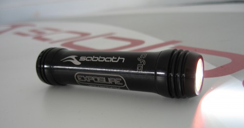
To get your creative juices flowing we'll be running a competition to find the right design – the winner will get a set of their kit and a Sabbath branded USE Joystick light plus of course the mighty satisfaction of seeing their creativity made flesh, well Merino Perform.

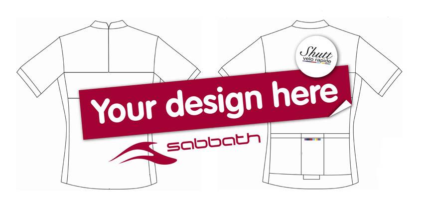
Entries are open now and the best five will go to a public poll in three weeks time so get your skates on! The jersey needs to have the Sabbath logo as the main one, with the Shutt VR logo on the chest. You can submit your entries in any form you like, what matters most is the power of your design. We've attached a blank template to the bottom of this story; those that want to go down the electronic route can import it in to programs like Photoshop or Illustrator, or you can keep it real and print them out and draw on them – either works for us. Or you can just go for the completely freehand approach.
Ideally we'd like you to attach a pic of your design to the bottom of this story, in true road.cc fashion, but you can also email them to info@road.cc or post them to road.cc, The Bath Brewery, Toll Bridge Rd, Bath, BA1 7DE.
road.cc's founder and first editor, nowadays to be found riding a spreadsheet. Tony's journey in cycling media started in 1997 as production editor and then deputy editor of Total Bike, acting editor of Total Mountain Bike and then seven years as editor of Cycling Plus. He launched his first cycling website - the Cycling Plus Forum at the turn of the century. In 2006 he left C+ to head up the launch team for Bike Radar which he edited until 2008, when he co-launched the multi-award winning road.cc - finally handing on the reins in 2021 to Jack Sexty. His favourite ride is his ‘commute’ - which he does most days inc weekends and he’s been cycle-commuting since 1994. His favourite bikes are titanium and have disc brakes, though he'd like to own a carbon bike one day.
Latest Comments
- Simon E 1 min 8 sec ago
but tomorrow they and the other shitrags masquerading as newspapers will return to screaming about cyclists, immigrants, benefit scroungers and...
- mdavidford 28 min 36 sec ago
Oxfordshire councils are quite capable of letting you down too!...
- lesterama 31 min 46 sec ago
Why not have a 5mph speed limit as part of the ETRO? Only a dick would ride fast through an otherwise pedestrianised street.
- levestane 42 min 55 sec ago
'each spoke' (single) and 'leaf spring' (made of many leaves) seems contradictory.
- PenLaw 1 hour 34 min ago
I guess Morrissey could claim it.
- wtjs 2 hours 23 sec ago
I do see a lot of delivery riders (on illegal e-motorbikes) with their faces covered...
- David9694 2 hours 40 min ago
Stuff like this seems more relevant than ever after the Trump victory. sorry not a funny
- mdavidford 3 hours 3 min ago
Someone was really worked up about e-scooters.
- JMcL_Ireland 3 hours 6 min ago
More likely the telling phrase is " In 2015, it was sold to private equity firm TZP Group" Hedge fund bell-ends with more lawyers than sense...
- hawkinspeter 5 hours 11 min ago
Certainly can't be as bad as those carbon monoxide alarms - I always get a headache from their loud beeping
Add new comment
68 comments
and my final submission...
Sabbath Jersey2.jpg
Just refined that last one a little bit...
Sabbath Jersey_0.jpg
oops
Here's my effort featuring big S's from the Sabbath logo disguised as retro stripes
Sabbath Jersey.jpg
I like the purple
on the other hand, DaveP's purple crayons have been working overtime...
Front - 2.png
Been trying to work the tagline "Sabbath, First and the Last" into a design.... As you can guess I've not got very far with this.
Had a little go at this one. The colors and simplicity are always fun to work with.
ShuttJersey2.jpg
I can't draw and don't have time to, apologies, but perhaps for those that can how about a "Black Sabbath" theme white on 'titanium' ...
http://11after11jc.files.wordpress.com/2010/02/black-sabbath-fallen-ange...
BTW I'm liking the designs posted before me v much.
Forgot to put up number 2...
jersey-ronan-lores2.jpg
here's one from andrew smith, he say:
"Each panel is a separate colour from the Shutt logo, simple but eye catching."
Drew_jersey.jpg
My entry! ;/
Gregoire500jerseytemplate.jpg
Ladies and gentlemen,
takes a bow, steps back and curtain pulls back to reveal...
jersey-ronan-lores.jpg
Here are some from Angelo at AC&A in Melbourne...
Picture 22_0.png
I love the top one.. Pete
Here's one which uses the Shutt palett, combined with a heavy influence of Loughborough University's purple in recognition of the frame designer's background. Also influenced by the classic Mondrian inspired La Vie Claire jersey.
jerseytemplate1.jpg
Are there no limitations on design/colours. Some of the current offerings are lovely but I'm not sure Shutt would be able to produce them in sportwool.
Nothing like a sunny day, climbing hills on two wheels...
jerseydesign.jpg
my 3 options/ schemes
jersey mcr3.jpg
My first two efforts...
jerseytemplate mk2_1.jpg
here's my effort...
shutt-vr-jersey.jpg
What about this...?
Sabbath-shuttvr template2 copy.jpg
Here's my first effort...
Sabbath-shuttvr template 1 copy.jpg
Ailess King
Spot on and ticks the boxes, especially the one regarding "being seen".
Posh
here's one from DaveP... he say:
"Grey and Black to compliment the Ti and Carbon of the bikes, with an architectural print to enhance the solidity. White trim to breakup the monotony ... ShuttVR logos to be the only colour (middle pocket to have the Shutt VR colour bar)"
back.png
Ha, I even have a "bike geek" t-shirt my beloved bought me!! Aint she sweet!
yeah sorry bfergie thought that's what I'd typed
that makes a lot more sense, bfergie
"the image on the back is the atomic structure of carbon a nice geek chic touch we think"
Not carbon atom..titanium, it was to match the Titanium bike! You can't read the writing but it says "rest on the SABBATH....Yeah right!!" I don'y have the computer ability to use anything but Paint but you get the idea.
Thanks Fergie.. I have heard you called many things, most nice, but geek.. that's a first…
Pete
Pages