- News
- Reviews
- Bikes
- Accessories
- Accessories - misc
- Computer mounts
- Bags
- Bar ends
- Bike bags & cases
- Bottle cages
- Bottles
- Cameras
- Car racks
- Child seats
- Computers
- Glasses
- GPS units
- Helmets
- Lights - front
- Lights - rear
- Lights - sets
- Locks
- Mirrors
- Mudguards
- Racks
- Pumps & CO2 inflators
- Puncture kits
- Reflectives
- Smart watches
- Stands and racks
- Trailers
- Clothing
- Components
- Bar tape & grips
- Bottom brackets
- Brake & gear cables
- Brake & STI levers
- Brake pads & spares
- Brakes
- Cassettes & freewheels
- Chains
- Chainsets & chainrings
- Derailleurs - front
- Derailleurs - rear
- Forks
- Gear levers & shifters
- Groupsets
- Handlebars & extensions
- Headsets
- Hubs
- Inner tubes
- Pedals
- Quick releases & skewers
- Saddles
- Seatposts
- Stems
- Wheels
- Tyres
- Health, fitness and nutrition
- Tools and workshop
- Miscellaneous
- Tubeless valves
- Buyers Guides
- Features
- Forum
- Recommends
- Podcast
news
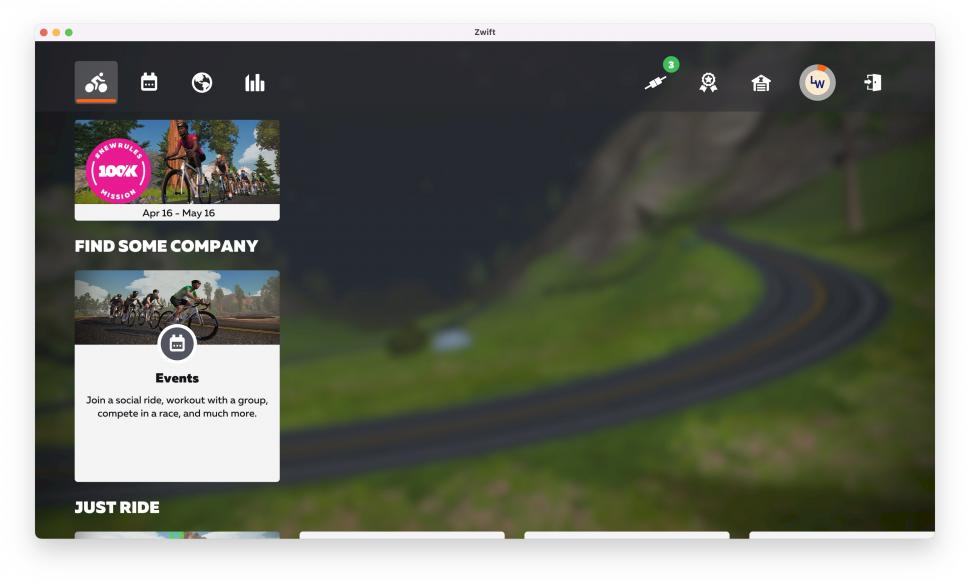
 Zwift update, April 2022 (credit - Twitter, Hamish O'Neill)
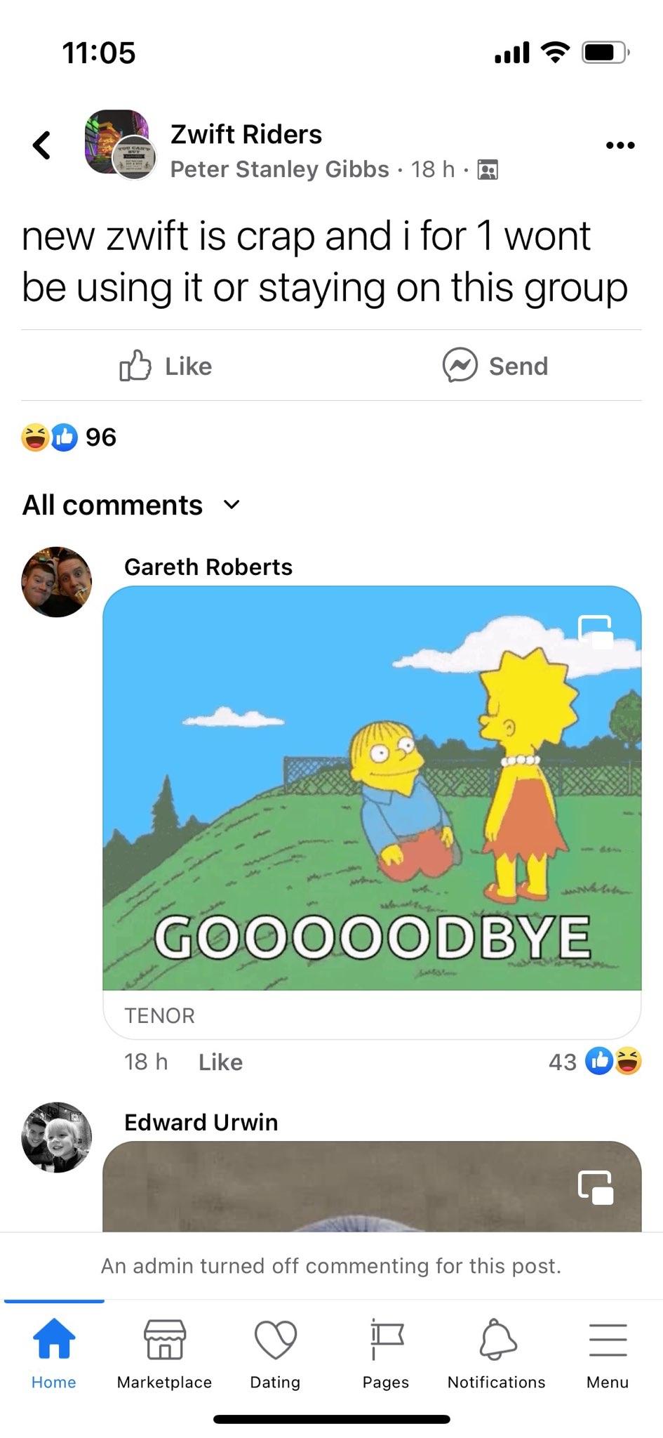
Zwift changes its layout – and people are very angry
Zwift has unveiled its latest range of updates – resulting in inevitable backlash from users unhappy at the app’s new interface.
The virtual training platform last week announced that it was rolling out a new user interface to almost all PC and Mac users who have set their language preference to English. The changes include faster loading times upon start up, an improved events interface, new music, the option to access the garage before starting a ride, and the ability to ride any world while doing a workout.
However, the updates have come in for criticism from some indoor training enthusiasts, who have described the new home screen layout as “pathetic”, while others questioned the omission of Zwift’s ‘Ride With’ feature, which allowed users to automatically join friends currently on course.
While some members of Zwift’s online forum said they were pleased with the changes, others criticised the updated home screen’s tile-based layout and scaling, which one user said meant that “everything requires more clicks/scrolling than it used to.”
On Twitter, Hamish wrote: “The new Zwift UI is pretty cool, but is there supposed to be this big blank area in the middle of the home screen? I also wasn't able to scroll. Otherwise, I love a lot of the other enhancements!”
The new #Zwift UI is pretty cool, but is there supposed to be this big blank area in the middle of the home screen? I also wasn't able to scroll. Otherwise I love a lot of the other enhancements! pic.twitter.com/jLXTfJdMmz
— Hamish O'Neill (@hamishoneill) April 29, 2022
Some users were altogether blunter in their assessment of the new interface, with one arguing that “we literally deserve a refund for this pathetic ‘updated’ screen that we are forced to beta test.”
Another member described the updates as a “nightmare” and claimed that it was now “very cumbersome” to access frequently ridden routes.
> Zwift U-turns on ban for user who exposed weight-doping hack
The absence of the ‘Ride With’ feature, which – unlike creating a scheduled Meetup Event – enabled users to join someone already riding at any point, has also proven a source of much consternation among Zwifters.
One forum member wrote: “I’ve just cancelled my Zwift account because of this update.
“The ‘Ride With’ feature is important to me and the main reason that I came to Zwift from RGT. Now I can’t use it because Zwift literally ‘forced’ this new (incomplete) update on me and others. Other users may not care about the ‘Ride With’ feature, but this user does.
“So, I’m not paying for something that I can’t use.”
Responding to queries about the future of the ‘Ride With’ function, Zwift’s Community Forum Manager said: “We’re still working on it, but no ETA to announce yet. We know it’s a high priority to bring back.”
Not everyone is upset with the changes, however. One user argued that the new interface “feels more useful and allows access to the things I want to be able to access before starting a ride”, and described the torrent of criticism from the Zwift community as a “classic ‘can’t please everyone’ moment”.
“Recent changes to the Home Screen were made to help Zwifters connect with some of our best in class in-game content,” a Zwift spokesperson told road.cc.
“In the process of making improvements to the home screen, we decided to reprioritise some features that were not heavily utilised, including Ride With.
“While we're glad that the new home screen is making it easier to find Zwift rides, races, and workouts, we are always in the process of developing features that make Zwift more fun and social.
“Based on incoming community feedback, we are currently considering how to reprioritise Ride With in the new home screen so that we can reintroduce this feature to the Zwift community as quickly as possible.”
> Wahoo buys RGT Cycling virtual training platform... and lays off 50 staff
Zwift’s controversial overhaul of its interface has coincided with Wahoo’s purchase of rival virtual training platform RGT Cycling.
The launch of the Wahoo X subscription service will give users access to all training content in the Wahoo SYSTM and RGT's virtual cycling routes under a single login.
However, the announcement came as news circulated of around 50 redundancies at the company, something Wahoo said was part of "strategic changes".
After obtaining a PhD, lecturing, and hosting a history podcast at Queen’s University Belfast, Ryan joined road.cc in December 2021 and since then has kept the site’s readers and listeners informed and enthralled (well at least occasionally) on news, the live blog, and the road.cc Podcast. After boarding a wrong bus at the world championships and ruining a good pair of jeans at the cyclocross, he now serves as road.cc’s senior news writer. Before his foray into cycling journalism, he wallowed in the equally pitiless world of academia, where he wrote a book about Victorian politics and droned on about cycling and bikes to classes of bored students (while taking every chance he could get to talk about cycling in print or on the radio). He can be found riding his bike very slowly around the narrow, scenic country lanes of Co. Down.
Latest Comments
- chrisonabike 17 min 45 sec ago
Hmm... I think that our ancestors' luxuries did in fact become necessities, and the Roman empire did indeed decline and fall before it changed...
- chrisonabike 1 hour 53 min ago
That was the one (same name in Scotland). Haven't tried a Boris bike yet (or Ken/Khan-cycle ?) but my understanding is they're conceptually...
- wtjs 2 hours 38 sec ago
It does say '12S' on the chainring! All we need now from this 'club member' is the picture of the actual crank break
- Bungle_52 3 hours 27 min ago
I think you may have misunderstood the word carnage....
- galibiervelo 4 hours 31 min ago
Love the design. The limitation to 170 mm cranks sent me to the kickR
- S.E. 5 hours 11 min ago
I'm not doing single track (no suspensions, only 30, 35 mm tyres) so 800 lumen is enough for me, on gravel type of trails at maybe max 20-30 km/h,...
- Joe Bloggs 7 hours 56 min ago
I suppose journalists can just about be forgiven for not knowing the difference between CdA and Cd but supposed Engineers can't. CdA is NOT the...
- ktache 8 hours 32 min ago
There is a pHd student at work who has an Adidas backpack in reflective iridescence, looks oil slicky in the day. I love both oil slick and...
- jrg_uk 8 hours 33 min ago
I think what you say has some sense to it (for WBD)....


Add new comment
17 comments
It really is the worst bit of UX design we've seen in years. It makes no sense and it looks like they gave this job to an intern engineer...
The changes may help me, I've never really gotten on with their UI.. I guess I'll find out next Autumn.
I've been dipping in and out of that thread on the Zwift forum (I think one of the quoted comments might even be one of mine ... I haven't waded back through it to check) and apart from the legitimate beef about removing the "Ride with" option (which I personally have never used) I genuinely don't get what the issues are.
Like mark1a, a minute or two to work out where everything was and off I went again.
Users used to complain bitterly about how old-fashioned and how limited the previous start screen was and how something more useful and more modern was needed (complete with massive howling when they delayed the rollout of an updated UI when the pandemic hit) ... now they are complaining bitterly about how the old one wasn't broken and didn't need fixing, and can they please have the choice to use the old one instead.
I am guessing the 90+% of users who don't go on the forums have just taken it in stride and are getting on with it.
The new UI was a surprise for me when it first loaded post-update, it took around 60 seconds to work out what was where. I've not given it a second thought since.
Not a zwift user currently so excuse the question but for navigation do they implement a sat-nav / Garmin within zwift or do you have to bring your own?
You either choose a course for a workout in which case the turns happen automatically or you make it up as you go. You can also choose to divert from a chosen course but the navigation then becomes manual.
This was me. Big culture shock when I joined at the last second for an event, but 5 mins of more leisurely exploration and its fine.
People need to get a life.
First world problems. No one cares.
Toys and pram?
This is a website about cycling, largely aimed at and read by people in developed Anglophone nations. Pretty much every issue it deals with is a "first world problem", as is complaining that a website you visit doesn't contain only content you consider sufficiently worthy.
haha this is kind of true. Debate the efficiency gains of ultegra vs 105 or thickness of bar tape to a farmer eking an existence in a lesser developed part of the world who hauls his wares to the market 30 miles a day through mud on a banged up bicycle for an income less than the cost of a rapha chamois cream.
Non-Zwift users don't care, but some users do seem to care and have no other worries in their lives at the moment.
Yeah, last night in the pub I was served quite an unsatisfactory pint of bitter, but I decided not to complain because I'm very concerned about the Russian offensive in Mariupol... perhaps people are capable of thinking about more than one thing at once?
No one said people couldn't think about more than one thing at once..? (Well technically you brought it up). But if Zwift UI is their biggest single thing to moan and worry about, then well done them.
I don't understand why you think this is their biggest single issue to worry about?
My 13 year old daughter refuses to go to school and has laid out a horrible, f***ed-up ultimatum unless we home-school her. Its really stressful and horrible. But I still don't like the Zwift UI updates.
Spot on there, sir or madam - we've all got bigger problems, doesn't mean we can't think about smaller ones (I've been out on the roads all week so have yet to see these Zwift updates, but if they have annoyed people they're entitled to feel that way, not sure why that's a problem for anyone else).
Could you make it her first project to redesign it?