- News
- Reviews
- Bikes
- Components
- Bar tape & grips
- Bottom brackets
- Brake & gear cables
- Brake & STI levers
- Brake pads & spares
- Brakes
- Cassettes & freewheels
- Chains
- Chainsets & chainrings
- Derailleurs - front
- Derailleurs - rear
- Forks
- Gear levers & shifters
- Groupsets
- Handlebars & extensions
- Headsets
- Hubs
- Inner tubes
- Pedals
- Quick releases & skewers
- Saddles
- Seatposts
- Stems
- Wheels
- Tyres
- Tubeless valves
- Accessories
- Accessories - misc
- Computer mounts
- Bags
- Bar ends
- Bike bags & cases
- Bottle cages
- Bottles
- Cameras
- Car racks
- Child seats
- Computers
- Glasses
- GPS units
- Helmets
- Lights - front
- Lights - rear
- Lights - sets
- Locks
- Mirrors
- Mudguards
- Racks
- Pumps & CO2 inflators
- Puncture kits
- Reflectives
- Smart watches
- Stands and racks
- Trailers
- Clothing
- Health, fitness and nutrition
- Tools and workshop
- Miscellaneous
- Buyers Guides
- Features
- Forum
- Recommends
- Podcast
review
£30.00
VERDICT:
Bin the terrible cover and you have a pretty well-presented photo book with all the facts you need on the first 100 years of the Tour de France.
Weight:
0g
Contact:
Available from amazon.co.uk and all good book stores
At road.cc every product is thoroughly tested for as long as it takes to get a proper insight into how well it works. Our reviewers are experienced cyclists that we trust to be objective. While we strive to ensure that opinions expressed are backed up by facts, reviews are by their nature an informed opinion, not a definitive verdict. We don't intentionally try to break anything (except locks) but we do try to look for weak points in any design. The overall score is not just an average of the other scores: it reflects both a product's function and value – with value determined by how a product compares with items of similar spec, quality, and price.
What the road.cc scores meanGood scores are more common than bad, because fortunately good products are more common than bad.
- Exceptional
- Excellent
- Very Good
- Good
- Quite good
- Average
- Not so good
- Poor
- Bad
- Appalling
In Tour De France 100, Richard Moore celebrates 100 editions of the Tour de France with some stunning images from the race's history, some classic, some rarely seen.
I must admit my heart sank a little when Tour De France 100 by Richard Moore was eased off the postie's aching shoulder to be signed for. Nothing to do with Moore's work. He's an excellent and very knowledgeable sports writer. It's just the cover. I'd seen the book online and the cover is a horizontal split between a beautiful and classic black and white image of a line of riders in the mountains and one of those god awful modern blurred grimacing frontal sprints - the long lens 'press 'n' pray' snap so adored by lazy sports editors since the advent of long lenses and auto focus in the late 1980's. Combined with a back cover grid of riders from across the eras the cover as a whole reminds me of one of those remaindered books you see in bargain bins with red stickers on. Whoever it was at Bloomsbury who decided on the cover should be taken out and shot.

Fortunately, inside the cover, all is well. Moore's skill in combining fine images and serious text establishes the book far above a general public anniversary cash-in. Separated into 12 chapters each covering roughly 7 years (allowing for the world wars) Moore neatly focuses on each era and its stars and the changes the race itself undergoes to become the event but is today. He deals with Armstrong, Pantani and EPO and dips back into the Delgado affair before the dominoes are stopped in their topple by the wall that is Big Mig.
Partial histories of potential doping aside Tour De France 100 is a good book. Moore's had access to L'Equipe and Getty's large Picture Post and Hulton archive to choose some of the best images from the first 70 years of the tour and he's taken full advantage of the riches on offer. He weaves the triumphs and tragedies around them with energy.
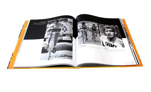
Much of the photography is truly superb. We're used to seeing grainy shots of poor wretches in sweaters with tyres wrapped around each armpit, but on this occasion the print quality is so clean and many of Moore's image choices so new you turn pages and find an almost three dimensional quality; the sweat runnels on riders faces, those wonderful bikes with their metal placard numbers and dusty sunlit streets from the 1930s so clear you can almost identify produce in shop windows. Even for Tour de France history buffs this is a treat.
The dimensions of the book bring out the details superbly - something we're no longer used to with pixel screens. With many of the images A4 and larger you can drink in the detail of spectators' faces and fashion. How did western civilisation ever reach the point when it now considers sweat pants and nylon football shirts to be more comfortable and stylish than generous suit trousers with button braces, white shirt and tilted fedora? I don't know where it all went wrong but it's time to introduce smart comfy retro wear again for spectators and make it a UCI ruling.
It's also a treat to see some of the work of Bert Hardy. Hardy was Picture Post's best photographer in the 1950s and his skill with light and positioning often gives his work an almost ethereal glow. If you had to choose a single photograph that encapsulates the Tour de France his image on page 77 would be a good choice. Three riders plugging away up a mountain climb almost into camera, sun broiling the shoulders, faces lit by the glare from the dusty white pebble track and a long zig zag of conquered road dropping away behind them.
Moore has found fresh images for the more modern era too. Hinault actually smiling as he's mobbed by happy fans in 1978 is almost as worrying as his grimacing. I would still have stayed well clear of his teeth if I were them.
In some ways the colour images are not as effective as the black and white. To publishers it seems acceptable to tweak black and white to bring out the best interpretation of the negatives, whereas editors who are not photographers tend to shy away from altering the often gun metal dark quality of transparency, or rushed colour print images, to produce a better result. If it's acceptable to enhance monochrome then it should also be acceptable to enhance historic colour images.
Photographic veracity over appeal is all very well, but like 'Play it again Sam' being the line from Casablanca that isn't actually said photo captions tend to pass into fact unless corrected. Moore corrects a Picture Post caption error which identifies the Col Du Tourmalet as 'Le Torniquet'.
Here's a couple of Moore's that need to be addressed in future editions. On page 69 it's not Bartali leading but Coppi. As Moore will know - it's all about the nose with Coppi.
Finally, I've seen this more than once which is why it rankles: there is absolutely no way on earth that the image on page 25 of Octave Lapize tackling the Tourmalet in 1910 is shot at night and lit with car headlights. Film stock and lenses in 1910 just weren't fast enough to do that and register the specatators and the whole mountainside as well. Even with a flash array the size of a house just behind the camera, even now, you would not get this image in darkness. The spectators are lit from the sun - as is the bar of the windshield on the car. It's dawn's early light and Lapize must be high up the mountain pass rather not just starting it. Some newspaper editor back in 1910 slapped on a bit of poetic licence and the myth has merrily been pedalled for over 100 years as far as Moore. Never mind. Nobody's perfect. Now that was said in a film...
Verdict
Bin the terrible cover and you have a pretty well-presented photo book with all the facts you need on the first 100 years of the Tour de France.
road.cc test report
Make and model: Tour De France 100 by Richard Moore
Size tested: n/a
About the tester
Age: 47 Height: Weight:
I usually ride: A 20 year old Condor Italia on the school run. My best bike is: Condor Moda Ti - summer bike
I've been riding for: Over 20 years I ride: Every week I would class myself as: Experienced
I regularly do the following types of riding: road racing, club rides, sportives, general fitness riding,


You forgot ignoring half the race to show awkward interviews with the riders' Proud Parents™ instead.
Obviously it means 'springing out of the bunch' on a critical sector. Or maybe it's referring to the time of year.
Car crashes through garden wall for second time in 18 months https://www.wiltshire999s.co.uk/car-crashes-garden-second-time/
Woman taken to hospital after flipping car onto roof in Trowbridge...
Its blindingly obvious from the image that the DKE of the buses include the mirrors which extend to nearly reach the edge of the tarmac pavement on...
It's sad when being very good at your job - any job - isn't enough to earn a decent living. It shouldn't be that way....
Bont double wide wearer here. Even Lake, for me, are too narrow in the toebox and midfoot, but Lake work for a lot of people....
Bigly!
I never heard of anyone having their leg sliced off / unexpectedly wiping out using a spoon brake, but discs...
Meanwhile, in the Netherlands... (cycling to hospital, s''Hertogenbosch, Utrecht. Cycling to hospital and cycle parking, Assen)....